|
I found this building on ArchDaily's website. It pretty much sums up the triangulation and faceting of the station shelter that I have started. In this case, it is a building facade and it is all in glass. Something to think about because in my review some people brought up that it might be a little to dark and heavy feeling inside and out of the station. Check out the link below cause it really is a beautiful facade! http://www.archdaily.com/7093/basque-health-department-headquarters-in-bilbao-coll-barreu-arquitectos/
0 Comments
We had our first of two Mid-Reviews on Monday. I was working off of what I had started about a week ago and moving forward with it at an overall perspective (Site Plan and Site Model) and also at a small vignette scale (Human Scale Perspectives and vignettes). Zach and I worked on cutting a site model together on Saturday that we can use for the review and for the Final eventually. As I was preparing my drawings, it became clear that I didn't really have a sense of scale for the large shelter I was designing, and realized that it could very quickly become a scary space. I am aware that it is a fairly solid piece, though through making a physical model and placing into the site, it didn't seem too out of scale, nor was there little light. It surprisingly had really nice shadows and light patterns on the inside of the station. So I forged on to the Review knowing that I probably would get some criticism about the scale, relationship to the plaza, and natural elements. So at the Mid-Review, I started with a desk crit with Erica Ceder of FFA. I thought having the desk crit was really helpful at the beginning of the review because it gave me guidance as to what to speak on at the actual review. She had some good insight into what was wrong, what was working, and where I was totally off! Then after the desk crit, I had the review with another FFA Architect and Jim Pettinari. They both added some good insight and brought out some good advice for developing my piece further. Integrating nature more into the site, addressing the plaza as a program and create pockets of space for users rather than large open space. They also wanted me to investigate the structural system that would be used to span the 30x200ft space where the station is placed. They then said that some visits to successful large plazas within Portland would be helpful in programming my plaza. Overall, there were useful comments, and some issues with timing and what I was able to present vs. what I talked about. I hope that the next review would be a little more developed with the time frame, and hopefully the reviewers would be accepting of our short time frame of design.     I found this on archdaily's website when I was researching for studio, and it immediately drew my attention. I saw the color, and the variation of density and how it undulated across the plaza, and immediately wanted to know what it was, how it did it, and if it worked in Phoenix's extreme climate. Apparently it's just off the shelf electrical conduits and unistrut hangers? They vary in shades of green and provides shade but still allows light to penetrate so it's not completely dark and closed off. They also included solar panels integrated into the structure that holds up the conduits to power the stations lights at night! I really want to work with a surface that undulates, interacts, and materializes from one thing to another and this might help me get somewhere!! here is the link to the archdaily site where you can read more and find more of the pictures like the one below! http://www.archdaily.com/26182/phoenix-civic-space-shade-canopies-architekton/#more-26182 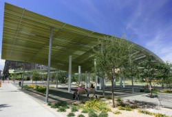 I chose to research Floating Green by the Chinese artist Ling Fan. It is an installation located in Pudong Zhangjiang Hi-tech Park in Shanghai China, that addresses the idea of a public lawn, and how it is no longer purposeful for what it was originally brought to a site to accomplish. “A lawn represents social commonwealth, an urban substitute for the productive soil of the rural environment.” (Ling Fan) It is placed in cities to represent nature in an urban context, and create a space for relaxation and slowing down. The lawn is supposed to be something people can use, whether it’s walking on, laying on, playing on, etc. But the problem with this idea is that the lawn slowly browns, and becomes an unsightly object that now must be maintained and kept from public interaction. It’s not uncommon to see a nice large lawn in a park and there is a “keep off” sign posted so that it stays nice and green with little maintenance. What Ling Fan wanted to accomplish was to bring back the lawn in an inhabitable way so that it once again became a part of the urban landscape. Ling thought that street furniture would be the best way to go about integrating the urban landscape with the human element once more. Ling was intrigued by the idea that lawn is supposed to represent a natural atmosphere, when in actuality it is a completely engineered element that has been genetically enhanced, mass produced into rolls that get shipped around the country on trucks. He saw the “Floating Green” as an urban element of lawn that detaches itself from the flat Earth and folds it and structures it to form an inhabitable piece. It draws on the interest that instead of “keeping off” the lawn, the user is drawn to “hop on” the lawn and touch the greenery. I chose this as my case study because I liked the green element in it, and I was intrigued by the form and nature of the sculpture. I like how it goes from ground plane to furniture to wall in one fluid motion, much like how I see my project taking the direction of. I like this uniform element where it is one continuous surface that creates 3 or even 4 planes. Ideally, I would see my plaza being integrated with the station by being one surface that is continually wrapped from plaza floor, sculptural wall, to shelter piece. Ling Fan’s piece is just one example of how any material can be inhabitable and continuous with an artistic appeal. Sources: http://www.inhabitat.com/2009/09/26/floating-green-a-grassy-bench/ http://www.designboom.com/weblog/cat/10/view/7557/ling-fan-floating-green.html http://www.fatflatfloat.com/floating-green-%3F%3F%3F%3F All images were found at www.inhabitat.com/2009/09/26/floating-green-a-grassy-bench/           This last Wednesday we did a design charrette with Brooke Muller's class from Eugene. Zach and I worked with a group of students who were designing a mixed use project to the south of the Civic Drive station. During our charrette with the Eugene students, Zach and I got some good feedback about what could be addressed better, and what worked well so far. We had two schemes presented, but we decided to further investigate the "dug-out" scheme where we designed a sunken plaza to the north of the station platform. The other scheme we did was called the "ramp-scape" that consisted of a large boardwalk/ramp that went over the station and connected both sides of the site with each other. One of the things we got in both the review and the charrette was that we should have kept developing the ramp-scape because it was intriguing and was something they hadn't seen before. It was a stretch for the budget and ideal phasing of the project, but conceptually it was interesting. The students from Eugene tried to help by figuring out how to blend the two schemes together so you can get that conceptual ramp feeling, but still have the separation of platform and plaza as well as safety and practicality. I think for me in the next couple weeks I will concentrate on how to bring in the best parts of the ramp-scape to the dug-out scheme to make a cohesive and functioning site design. I will concentrate on the large "art wall" and station shelter and make it more continuous, something that become a ground plane, then wall, then roof, and possibly create something that would be similar to a ramp but more connected to the dug-out scheme. I am interested in this wall/shelter because I would like to investigate it for my final project at the end of the quarter. Overall, it was nice to get some student feedback and have them draw out some ideas that we hadn't thought of.      |
meellen hagen . architecture student . blog . fall 2009 . archives
December 2009
categories |
 RSS Feed
